Tables appear frequently in IELTS Academic Task 1. Unlike line or bar charts, a table presents raw numbers or percentages in rows and columns. That can feel overwhelming — but it also gives you control: tables are perfect for grouping, ranking, and comparing. The examiner wants to see that you can select the main features, summarize trends, and report clearly and accurately — not rewrite every cell.
This guide gives you everything: the exact structure to use, model answers, vocabulary, Band 8+ strategies, and step-by-step exercises especially for beginners who struggle with sentence structure.
1 — Understand the task: what the table asks you to do
A table usually shows comparisons between categories across one or more dimensions (years, countries, age groups, income bands, etc.). Your job:
- Select main features (largest/smallest values, clear differences, notable similarities, and notable trends if multiple years are shown).
- Provide an overview (big picture).
- Support the overview with selected figures (numbers/percentages) — don’t list everything.
- Organize the report logically (group by row or column).
Quick tip: Think “overview first, details second.” The overview is essential for Band 6+ and beyond.
Band 8+ Insight — Table reading strategy
Before writing, spend 1–2 minutes:
- Scan the table for highest/lowest values.
- Look for clear groupings (e.g., high, medium, low).
- Note any obvious changes across years or groups.
- Decide whether to group by row or by column for the body paragraphs.
2 — The 4-part structure (simple, reliable & exam-friendly)
Use the same 4-part structure you’ve used for other Task 1 visuals:
- Introduction (1 sentence) — Paraphrase the task.
- Overview (2–3 sentences) — State the main trends/most important features (highest, lowest, notable contrasts).
- Body Paragraph 1 (3–5 sentences) — Describe the first main group of data logically.
- Body Paragraph 2 (3–5 sentences) — Describe the second main group / contrasts / changes.
Word target: 150–180 words (aim for ~170). Examiner cares more about clear structure and selection than about hitting a precise number.
Band 8+ Insight — Organization choices
Decide whether to organize by:
- Category grouping (e.g., high vs low consumer groups) or
- Time periods (e.g., early vs recent years) or
- Rows vs columns (if one dimension is clearly more important).
Choose the option that makes your paragraphs more cohesive and comparative.
3 — How to write each section (step-by-step)
A. Introduction — Paraphrase the question
Paraphrase — don’t copy. Use synonyms and change the sentence structure.
Formula: The table + illustrates / shows / presents + what + where + when.
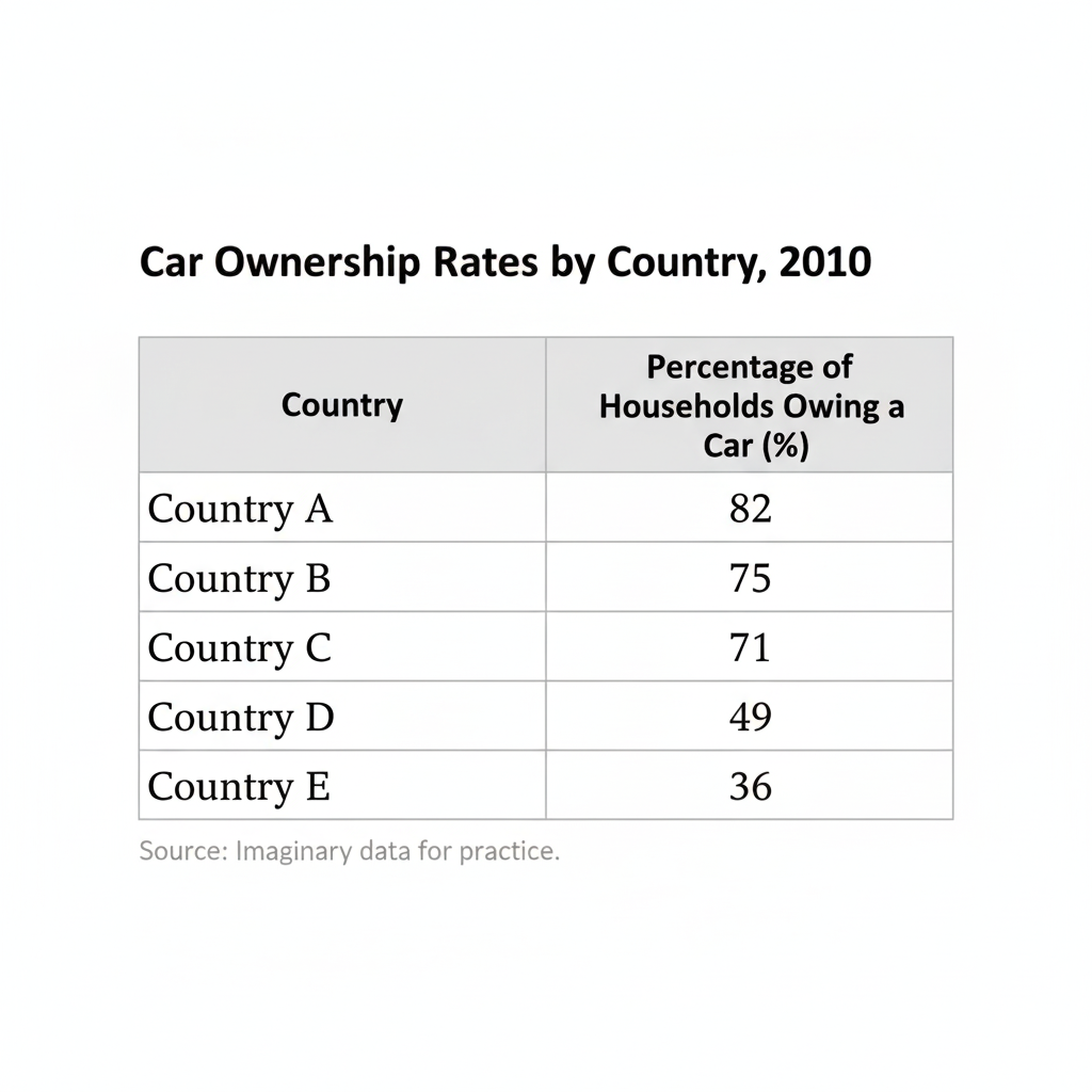
Example Task: The table below shows the percentage of households owning a car in five countries in 2010.
Intro (paraphrase): The table provides information about car ownership rates across five countries in 2010.
Quick alternatives: depicts, compares, gives data on, details.
B. Overview — the heart of your report
Write 2–3 sentences that summarize the most important things:
- Which value is highest and which is lowest?
- Any clear grouping (e.g., three countries with high rates vs two with low)?
- Any noteworthy pattern (e.g., similar values, even distribution)?
Example overview:
Overall, Country A had the highest car ownership rate, whereas Country E had the lowest. There was a clear divide between three countries with relatively high ownership and two with much lower rates.
What NOT to do in overview: Include too many numbers — keep it broad.
C. Body paragraphs — report the detail logically
Group related data and compare. Avoid listing every row and column.
Approaches:
- Group by value: name the high group and the low group, then give supporting figures.
- Group by categories: describe one column (e.g., “urban households”) then the other (e.g., “rural households”).
- Chronological: if the table shows years, describe earlier then later years, emphasizing change.
Example Body 1:
Three countries — A, B, and C — reported ownership above 70%, with Country A leading at 82%, followed by B and C at around 75% and 71% respectively.
Example Body 2:
In contrast, Country D and E recorded much lower rates — 49% and 36% respectively — indicating a substantial gap of almost half between the highest and the lowest.
Band 8+ Insight — Using percentages wisely
When quoting numbers, choose representative values (rounding is okay if values aren’t exact). Use comparative language: approximately, roughly, just over, just under, about.
4 — Grammar & tense choices for tables
Tense depends on the data:
- Single-year or static data → Present simple: The table shows that X accounts for 30%.
- Multiple years (past) → Past simple or past continuous where appropriate: In 1990, X was 20% but by 2010 it had risen to 35%.
- Changes over time (present perfect acceptable for recent impacts) → has increased can be used if timeline links to present, but past simple is safe for strict historical data.
Useful structures:
- Comparisons: X is higher than Y; X exceeds Y by 10 percentage points; X is roughly twice as high as Y.
- Change: X rose/fell/dropped/declined/increased by X% (or by X percentage points).
- Stable: X remained stable at 20%.
5 — Ultimate vocabulary bank for Tables
Verbs for change & comparison
- increase, rise, grow, climb, surge, peak
- decrease, fall, decline, dip, drop, plunge
- remain stable, stay constant, level off, plateau
Phrases for proportions & amounts
- account for, make up, constitute, comprise, represent
- the largest share, the smallest share, the majority, a minority, almost half, just under a quarter
Comparative structures
- X is higher than Y
- X is significantly greater than Y
- X was nearly double that of Y
- there was a gap of X percentage points between …
Adjectives & adverbs to vary your language
- dramatic, significant, marginal, slight, marked, considerable, steady, gradual
Band 8+ Insight — Precise vs approximate language
Band 8+ answers use a mixture: precise where it matters (e.g., “Country A recorded 82%”) and approximations to avoid overloading with numbers (e.g., “around three-quarters”).
6 — Do’s and Don’ts (the checklist)
✅ Do’s
- Always include an overview.
- Group similar data logically.
- Use comparative language.
- Vary vocabulary (don’t repeat “increase” too often).
- Keep the tone formal and impersonal.
- Use accurate tenses and check subject-verb agreement.
❌ Don’ts
- Don’t copy the task statement word-for-word.
- Don’t describe every cell in the table.
- Don’t give reasons or opinions (e.g., “This is because…”).
- Don’t use contractions or informal language.
- Don’t cram too many numbers without interpretation.
7 — High-scoring phrases & sentence templates (useful for every table)
- It can be seen that …
- The highest proportion was recorded for … at X%.
- By contrast, … accounted for the smallest proportion, at X%.
- There was a marked difference between … and …
- X was approximately twice that of Y.
- While X remained stable, Y experienced a significant decline.
Full-sentence template (introduction):
The table compares the [measurement] for [categories/groups] in [place] in [year(s)].
Overview template:
Overall, [main trend], with [category] showing the highest figure and [category] displaying the lowest.
8 — Sample Table 1 (Model task + Band 9 answer)
📋 Sample Task prompt
The table below shows the percentage of households owning a car in five countries in 2010.
Summarize the information by selecting and reporting the main features, and make comparisons where relevant. Write at least 150 words.

✍️ Band 9 Model Answer
The table provides the percentage of households that owned a car in five countries in 2010.
Overall, Country A had the highest car ownership rate, while Country E recorded the lowest figure. There was a clear divide between three countries with relatively high ownership (A, B and C) and two with much lower rates (D and E).
Specifically, Country A led the list at 82%, followed by Country B and Country C at 75% and 71% respectively. These three countries all had ownership levels noticeably above 70%. By contrast, Country D and Country E lagged behind; Country D recorded a moderate 49%, and Country E had the smallest share at just 36%. The gap between the highest and lowest values was therefore substantial — nearly 46 percentage points — indicating significant differences in car ownership across these countries.
Band 8+ Insight — Why this works
- Clear overview, highlighting divide.
- Logical grouping (high vs low).
- Selected figures to support the overview (not every cell).
- Comparative phrase about the gap with exact number.
9 — Sample Table 2 (Practice task + beginner exercises)

🧩 Practice Activities (step-by-step for beginners)
Step 1 — Scan & Identify (2 minutes)
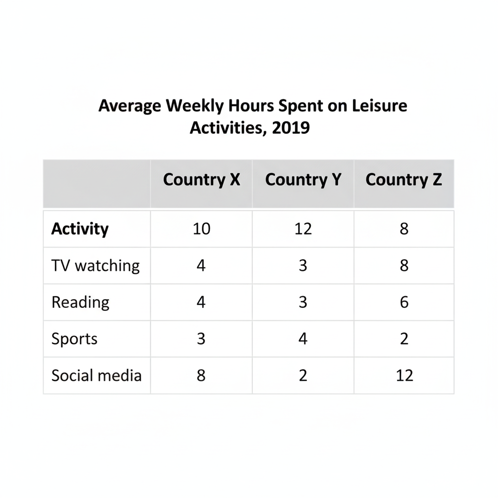
- Which activity takes the most hours overall? (TV & social media high)
- Which activity is least popular? (Sports/reading vary by country)
Step 2 — Vocabulary practice
Fill in the blanks using these verbs: accounted for / was the highest / remained steady / declined
- In Country Y, social media ________ 10 hours per week.
- Sports ________ the least time in Country Z.
(Answers: 1. was 10 hours — better phrasing: accounted for 10 hours ; 2. is/was 2 hours — was the least.)
Step 3 — Build 3 sentences (sentence-level practice)
Turn this note into a sentence: TV — Country X 10, Country Y 12
Example: TV watching was popular in all three countries, peaking at 12 hours per week in Country Y and standing at 10 hours in Country X.
Step 4 — Mini report (100–130 words)
Write a short report summarizing major patterns. Focus on 3–4 key comparisons only. Keep sentences short and use linking words: overall, in contrast, while, whereas.
Band 8+ Insight — Scaffolding for weaker writers
Beginners should practice by building sentences from notes (Step → Sentence → Mini-paragraph → Full report). Always start by grouping (e.g., high vs low activities) — this reduces cognitive load when writing.
10 — Common errors and how to fix them
| Error | Why it’s wrong | Fix |
|---|---|---|
| Listing everything cell-by-cell | Overwhelms and lacks analysis | Group related items and summarize |
| No overview | Examiner penalizes Task Achievement | Always add 1–2 overview sentences |
| Wrong tense usage | Confuses timeline | Use present for single-year, past for historical data |
| Using casual language | Lowers formality | Replace “a lot” with “a significant proportion” |
| Repetition of vocabulary | Lowers Lexical Range | Use synonyms from the vocabulary bank |
11 — Final checklist (before you submit)
- Paraphrased introduction included
- Clear overview present (big picture)
- Logical grouping used in bodies (high vs low, rows or columns)
- Key figures included — not every number
- Correct tense used throughout
- Formal tone and varied vocabulary
- Report length ~150–180 words
12 — Extra practice drills (do these every day)
- Take any table (news, stats) — spend 2 minutes selecting main features, 8 minutes writing a 150-word report.
- Re-write your report replacing 3 words with synonyms from the vocabulary bank.
- Time yourself: try 15 minutes per task under exam conditions.
Closing — you’re ready to turn tables into triumphs
Tables reward clear thinking and neat language. If you follow the 4-part structure, always start with an overview, group the data logically, and use comparative vocabulary intelligently, you’ll convert messy numbers into a well-structured, examiner-friendly report.
Go on — pick a table, write a draft, and send it to me if you want line-by-line feedback. GoatGuruEnglish is here to help you get that Band you deserve.
Annotated Exemplar 1 – Band 6.5 / 7.0 Response
Task
The table below shows the percentage of households owning a car in five countries in 2010.
Student Answer
The table shows information about car ownership in five countries in 2010.
Overall, car ownership was higher in Countries A, B and C, while D and E had fewer cars. Country A had the most car owners and Country E the least.
In detail, about 82% of households in Country A had a car, which was slightly higher than in Country B (75%) and Country C (71%). The other two countries had much lower figures. In Country D, 49% of families owned a car, while only 36% of households in Country E had one. The difference between Country A and E was quite big, almost half.
Annotations
🟩 Task Achievement (Band 7):
✅ Covers all key features (highest, lowest, comparisons).
✅ Overview included.
❌ Slightly short; could mention groups more clearly or note the “divide” explicitly.
🟦 Coherence & Cohesion (Band 7):
✅ Logical paragraphing (intro, overview, details).
✅ Uses linking words while, while only, and the difference.
❌ Could use more cohesive devices (in contrast, respectively, whereas).
🟨 Lexical Resource (Band 6.5):
✅ Uses basic accurate vocabulary: higher, lower, difference, most, least.
❌ Limited variety — repeats “had,” “countries,” “car ownership.”
💡 Suggest replacements:
- “recorded,” “registered,” “the proportion of households.”
🟧 Grammar Range & Accuracy (Band 7):
✅ Mostly accurate sentences, correct tenses.
❌ Range limited — mostly simple sentences with few complex clauses.
🧠 Feedback summary:
👉 Good clarity and accuracy, but lacks advanced vocabulary and sentence complexity.
👉 To reach Band 8+, the student should expand the overview and use a richer range of linking phrases and comparative structures.
💬 How to elevate this to Band 8+:
Improved sentence example:
While around four-fifths of households in Country A owned a car, the figure for Country E was just over one-third — a difference of roughly 46 percentage points.
Added advanced comparative:
The gap between the highest and lowest values was therefore substantial, reflecting considerable variation in car ownership levels.
🌟 Annotated Exemplar 2 – Band 8.5 / 9.0 Response
Task (same)
The table below shows the percentage of households owning a car in five countries in 2010.
Model Answer (Band 9)
The table provides data on the proportion of households that owned a car in five countries in 2010.
Overall, car ownership was highest in Countries A, B and C, each exceeding 70%, while Countries D and E lagged significantly behind. There was a clear divide between nations with high and low ownership levels.
In more detail, Country A led with 82% of households possessing a car. Countries B and C followed closely, with roughly three-quarters and just over 70% respectively. By contrast, Country D recorded less than half of households owning a car (49%), and Country E had the smallest proportion at 36%. The gap of nearly 46 percentage points between the highest and lowest figures illustrates striking variation in car ownership among the five countries.
Annotations
🟩 Task Achievement (Band 9):
✅ Excellent overview identifying key contrast (high vs low).
✅ Main features well selected and fully explained.
✅ Appropriate summarization — no over-detail.
🏆 Shows ability to summarize and highlight insights rather than list data.
🟦 Coherence & Cohesion (Band 9):
✅ Smooth logical flow: introduction → overview → two grouped comparisons.
✅ Variety of cohesive devices (while, by contrast, followed closely, respectively).
✅ Clear paragraph unity — each paragraph has a clear purpose.
🟨 Lexical Resource (Band 9):
✅ Strong academic vocabulary: proportion, lagged behind, recorded, striking variation.
✅ Synonyms skillfully used for “high” and “low.”
✅ Good collocations: clear divide, car ownership levels, percentage points, household possessing a car.
🏆 Demonstrates wide lexical range and natural precision.
🟧 Grammar Range & Accuracy (Band 9):
✅ Excellent control of complex sentences:
“While Countries B and C followed closely, Country D recorded less than half…”
✅ Correct tense, accurate punctuation, varied clause structures.
✅ No errors — fully accurate.
💬 Examiner’s Comment Summary
Band 9-level performance:
- Fully satisfies all requirements of the task (TA).
- Information logically organized and coherently linked (CC).
- Very wide vocabulary range used naturally (LR).
- Grammatical control is complete and effortless (GRA).
📘 Comparison Snapshot: Band 7 vs Band 9
| Criterion | Band 7 Example | Band 9 Example |
|---|---|---|
| Overview | “A had most, E had least.” | “There was a clear divide between nations with high and low ownership levels.” |
| Vocabulary | “higher,” “lower,” “difference.” | “lagged behind,” “clear divide,” “striking variation.” |
| Structure | Mostly simple sentences. | Mix of complex, comparative, and compound sentences. |
| Data handling | Mentions all figures. | Selects and groups logically. |
| Tone | Informal (families had a car). | Formal (households possessing a car). |
💪 Mini Training Section — Practice with Annotation Logic
Here’s how you can use annotation in class or self-study:
✏️ Task
The table shows average weekly hours spent on leisure activities in three countries in 2019.
Student Paragraph:
People in Country Y spent more time on social media (10 hours) than in the other two countries. TV watching was also popular, especially in Country Y, where people watched 12 hours weekly. However, people in Country Z read more (6 hours) than in the other countries.
Annotate it yourself:
- TA: Does it highlight overall trends or just list facts?
- CC: Are ideas logically connected (e.g., “In contrast,” “while”)?
- LR: How many unique words for “spend time” can you find?
- GRA: Count the sentence types — how many complex sentences?
Click Here For Task 1 Flow Chart/Process overview and practice activities.
