Among all IELTS Writing Task 1 visuals, the line graph is one of the most common — and for many students, one of the most intimidating.
But once you understand how to describe trends, comparisons, and changes over time, the line graph becomes the easiest 150 words you’ll ever write.
In this complete guide, we’ll break it down from start to finish:
- The perfect structure
- Examiner expectations
- The best tenses to use
- Powerful vocabulary & collocations
- Common do’s and don’ts
- Two unique sample tasks with exercises
Let’s get started.
🎯 1. Understanding the Task
What You’ll See:
You’ll be given a line graph showing how one or more variables change over a period of time.
For example:
- The number of car owners from 1990 to 2020.
- Unemployment rates across different countries between 2000 and 2015.
- Average global temperatures over decades.
What You Need to Do:
Summarize the information by selecting and reporting the main features, and make comparisons where relevant.
You must not give opinions or reasons.
🧩 2. The 4-Part Structure (The Band 9 Blueprint)
| Section | Purpose | Word Count | Key Tip |
|---|---|---|---|
| 1. Introduction | Paraphrase the question | 1–2 sentences (~25 words) | Change sentence structure, use synonyms |
| 2. Overview | Describe overall trends | 1–2 sentences (~30 words) | Highlight big picture, not details |
| 3. Body Paragraph 1 | Describe first set of data logically | 3–4 sentences (~50 words) | Group trends by similarity |
| 4. Body Paragraph 2 | Describe second set or time period | 3–4 sentences (~50 words) | Focus on key differences |
🪶 3. Writing Each Section
🏁 Introduction: Paraphrase the Question
Use synonyms and rephrase smartly.
Example:
Question: The line graph below shows the percentage of households with internet access between 1998 and 2018.
Paraphrased: The given line graph illustrates how the proportion of homes connected to the Internet changed from 1998 to 2018.
Tips:
- Use “illustrates,” “depicts,” or “shows.”
- Replace nouns (e.g., percentage → proportion, number → figure).
- Change structure (from “The graph below shows…” → “According to the line graph…”).
🔍 Overview: The Heart of Your Report
This is your summary paragraph — the examiner looks for this to award a higher band.
How to Write an Overview:
- Identify general trends (increase, decrease, fluctuation).
- Point out highest and lowest points.
- Avoid specific data.
Example:
Overall, Internet usage increased steadily throughout the period, with a particularly sharp rise after 2005. By contrast, the growth slowed towards the end of the timeline.
Pro Tip:
Use connectors like overall, in general, it is clear that, it can be seen that.
📊 Body Paragraphs: Data with Logic
Now describe specific trends, grouped logically:
- By time period (early vs. later years)
- By category (men vs. women, country A vs. B)
- By trend type (increasing vs. decreasing)
Example:
In 1998, only around 10% of homes had Internet access. This figure rose gradually, reaching nearly 50% by 2005. After that, the growth accelerated sharply, peaking at around 90% by 2018.
Tips:
- Always compare where relevant.
- Avoid random year-by-year narration.
- Use linking phrases: “by contrast,” “in comparison,” “while,” “similarly.”
🧱 Conclusion (Optional)
You don’t need a separate conclusion in Task 1, but you can add a short final remark only if it adds clarity:
To sum up, Internet access grew dramatically over the two decades, indicating the rapid digital transformation of households.
📈 4. Examiner’s Requirements (Band Descriptors Simplified)
| Criterion | What Examiner Wants | Key Tip |
|---|---|---|
| Task Achievement | Clear overview + relevant data | Don’t skip overview |
| Coherence & Cohesion | Logical flow + linking words | Group data meaningfully |
| Lexical Resource | Variety of vocabulary | Avoid repetition of “increase/decrease” |
| Grammar Range & Accuracy | Complex + correct structures | Mix tenses carefully |
⏰ 5. Grammar & Tenses for Line Graphs
| Time Type | Suitable Tense | Example |
|---|---|---|
| Past data only | Past Simple | Sales increased steadily from 2000 to 2010. |
| Future data (predictions) | Future (will/expected to) | The rate is expected to rise by 2030. |
| Present–Past mix | Present Perfect + Past | The number has risen dramatically since 1990. |
Structure Tip:
Use “from…to…”, “between…and…”, “over the period”, “throughout the years”.
💬 6. Vocabulary for Line Graphs
🔼 Verbs for Increase:
rise, grow, climb, soar, surge, rocket, shoot up
Example: The figure soared dramatically after 2010.
🔽 Verbs for Decrease:
fall, decline, drop, dip, plummet, plunge, go down
Example: The unemployment rate plummeted in 2015.
⚖️ Verbs for Stability:
remain stable, level off, stay constant, flatten out
Example: The percentage remained stable between 2005 and 2010.
🔁 Verbs for Fluctuation:
fluctuate, vary, oscillate, rise and fall
Example: The number fluctuated slightly during the early years.
📘 Adjectives & Adverbs
| Type | Words | Example |
|---|---|---|
| Big changes | dramatic, steep, sharp, rapid | There was a sharp increase in sales. |
| Small changes | slight, gradual, steady, moderate | The figure rose gradually after 2010. |
| Speed of change | quickly, slowly, steadily, significantly | Prices rose significantly in 2008. |
🧩 Collocations (Common IELTS Pairs)
- a sharp increase in + noun
- a gradual decline of + noun
- an upward/downward trend
- reach a peak of
- hit the lowest point at
- experience a period of growth
- fluctuate around
🧠 7. Do’s and Don’ts
✅ Do’s
- Include an overview (non-negotiable!)
- Use data selectively (not every number)
- Compare logically
- Use varied vocabulary
- Keep it formal (no personal opinions)
❌ Don’ts
- Don’t use future tense for past data
- Don’t describe each year individually
- Don’t give reasons or opinions
- Don’t copy the task statement word-for-word
📉 8. Sample Line Graph 1 (Explanation Task)
Task:
The line graph below shows the number of international students enrolled in three countries between 2000 and 2020.
[Describe Image: Three lines labeled USA, UK, and Canada, all increasing at different rates.]
Model Answer (Band 9):
The given line graph illustrates how the number of international students studying in the USA, the UK, and Canada changed from 2000 to 2020.
Overall, all three countries experienced growth in foreign student enrolments, with the USA maintaining the highest numbers throughout, while Canada saw the fastest rate of increase.
In 2000, around 200,000 international students were enrolled in the USA, compared to 100,000 in the UK and about 50,000 in Canada. Over the next decade, these figures rose steadily. By 2010, the USA reached 300,000, the UK nearly 180,000, and Canada 120,000.
From 2010 to 2020, growth accelerated in all countries, most notably in Canada, where the number tripled to about 300,000. The USA peaked at around 400,000, while the UK climbed to 250,000.
To sum up, although the USA remained dominant, Canada’s growth was the most dramatic during the period shown.
🧩 9. Sample Line Graph 2 (Practice & Exercises)
Task:
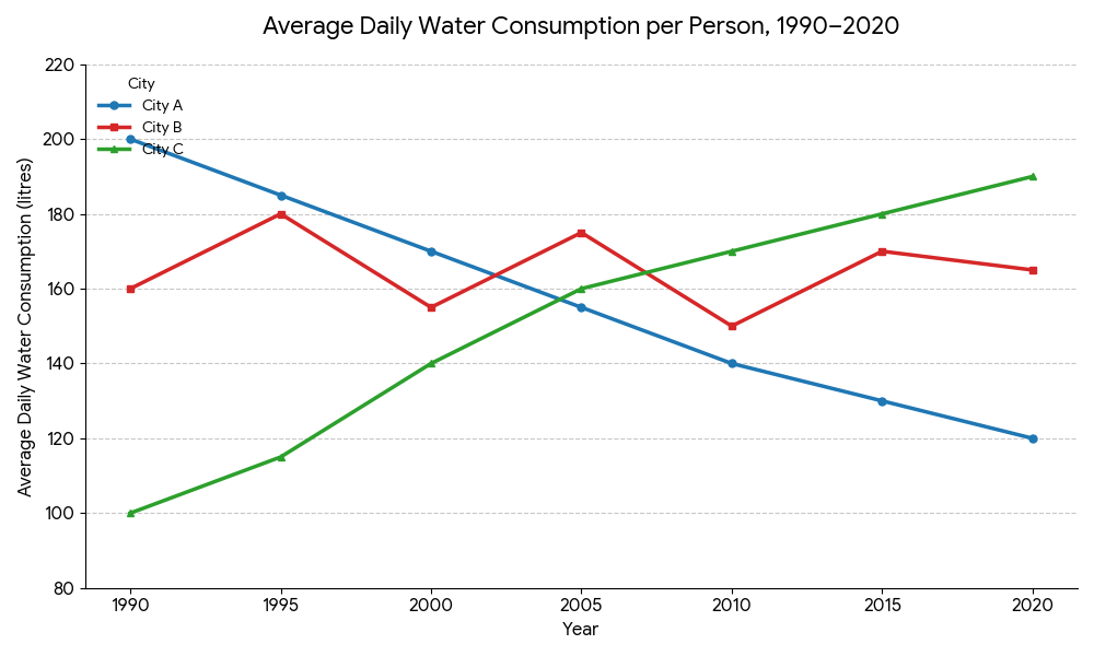
The graph below shows the average daily water consumption per person in three cities between 1990 and 2020.
[Describe Image: City A — gradual decline; City B — fluctuating; City C — steady increase.]

Exercise 1 — Identify Overview Points
👉 What are the general trends?
Hints:
🧾 10. Final Checklist Before You Write
| Step | What to Check |
|---|---|
| 1️⃣ | Paraphrased introduction |
| 2️⃣ | Overview included |
| 3️⃣ | Logical grouping of trends |
| 4️⃣ | Clear comparisons |
| 5️⃣ | Variety of vocabulary |
| 6️⃣ | Correct tenses |
| 7️⃣ | Around 150–180 words |
🧭 11. Common Mistakes to Avoid
- Writing “The graph shows in 2000 to 2020” → ❌ (Use from 2000 to 2020)
- Saying “The line is going up” → ❌ (Say The figure increased)
- Repeating “increase” 5 times → ❌ (Use synonyms)
- Mixing past and future tenses → ❌
🥇 12. Bonus: High-Scoring Phrases
- “It is evident that…”
- “There was a noticeable upward trend…”
- “By contrast, the figure for X fell slightly…”
- “The most significant growth occurred between…”
- “X outnumbered Y throughout the period.”
🧩 13. Practice Challenge for Students
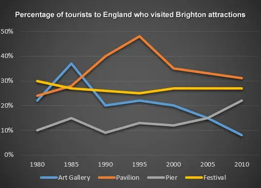
Try writing a report on the following line graph.
Your Task:
Write 150 words using:
🔚 Conclusion
Mastering the line graph is all about structure, logic, and clarity.
Once you learn to identify the big picture first and then describe data logically, you’ll never struggle with Task 1 again.
With the vocabulary, exercises, and templates in this guide, you’re already halfway to your Band 9 report.
Remember: Clarity beats complexity. Accuracy beats decoration.
Now — grab a pen, pick any line graph, and start writing like a legend.


