Bar graphs are one of the most frequent visuals in IELTS Writing Task 1 — and often one of the most misunderstood. Many students panic when they see multiple bars, categories, or colors. But once you understand how to group information logically and describe comparisons, bar charts become simple and even fun to describe.
In this complete guide, we’ll cover every aspect step by step:
- ✅ The best structure for a Band 9 report
- ✅ The examiner’s requirements
- ✅ The right grammar and tenses
- ✅ Essential vocabulary & collocations
- ✅ Common do’s and don’ts
- ✅ Two unique sample tasks (one with explanation + one for practice)
Let’s make bar graphs your new best friend.
🧩 1. Understanding the Task
What Is a Bar Graph?
A bar graph (or bar chart) is used to compare quantities or categories.
It may show:
- One set of data (e.g., percentage of male and female smokers in 2020), or
- Multiple sets (e.g., male vs. female smokers from 2000 to 2020).
What You Must Do:
You’re asked to:
Summarize the information by selecting and reporting the main features, and make comparisons where relevant.
No opinions, no explanations — just facts and comparisons.
🧱 2. The 4-Part Structure (Your Band 9 Foundation)
| Section | Purpose | Word Count | Key Tip |
|---|---|---|---|
| 1. Introduction | Paraphrase the question | 1–2 sentences (~25 words) | Avoid copying task words |
| 2. Overview | Summarize overall trends | 1–2 sentences (~30 words) | Highlight key patterns |
| 3. Body Paragraph 1 | Describe the first group logically | 3–4 sentences (~50 words) | Group data with similarities |
| 4. Body Paragraph 2 | Describe second group or contrast | 3–4 sentences (~50 words) | Focus on key differences |
✍️ 3. Writing Each Section
🏁 Introduction
Your first sentence should paraphrase the task.
Example:
Task: The bar graph shows the percentage of households owning cars in five countries in 2010.
Paraphrased: The given bar chart compares the proportion of households that owned a car in five different nations in 2010.
Tips:
- Use “illustrates,” “compares,” “depicts,” “shows.”
- Change nouns: percentage → proportion, countries → nations, years → time period.
🌎 Overview
Your overview gives the big picture — overall trends, extremes, and general patterns.
Example:
Overall, car ownership rates were highest in Germany and the UK, while the lowest proportions were seen in Spain and Italy.
Key Formula:
- Mention highest/lowest
- Highlight main similarities or differences
- Avoid data or numbers
Useful starters:
- Overall, it can be seen that…
- In general, the most striking feature is…
- It is clear that…
💡 Band 8+ Insight:
Use comparative structures to make your overview powerful:
While X had the highest figures, Y’s percentage was significantly lower.
📊 Body Paragraph 1
Describe and group the first set of data logically.
Example:
In 2010, around 80% of households in Germany and the UK owned at least one car, which was significantly higher than in France (60%). Spain and Italy recorded the lowest rates, at about 45% and 40% respectively.
Tips:
- Group similar values (e.g., high vs. low).
- Use accurate prepositions (at, with, by).
- Use comparative adjectives (higher than, lower than).
📈 Body Paragraph 2
Describe contrasts or secondary patterns.
Example:
Although car ownership in Spain and Italy was relatively low, the figures for both countries were closer to each other than to those in Germany or the UK. France occupied a middle position throughout.
💡 Band 8+ Insight:
Use “range” and “gap” expressions:
The gap between the highest and lowest figures was nearly 40 percentage points.
🧱 Conclusion (Optional)
Like in line graphs, you don’t need a separate conclusion.
But if you want to wrap up naturally:
To sum up, car ownership varied widely among the five nations, with Western European countries showing much higher rates.
🧠 4. Examiner’s Expectations (Simplified)
| Criterion | What the Examiner Checks | Your Focus |
|---|---|---|
| Task Achievement | Overview present + relevant data | Never skip overview |
| Coherence & Cohesion | Logical grouping + connectors | Use contrast & comparison words |
| Lexical Resource | Range of vocabulary | Avoid repeating “increase” or “high” |
| Grammar Range & Accuracy | Complex + accurate sentences | Mix structures, stay clear |
⏰ 5. Grammar & Tenses for Bar Graphs
Bar graphs may show:
- One year (static data) → Use Present Simple
- Multiple years (change over time) → Use Past Simple
- Future predictions → Use Future Tense (will, is expected to)
| Example | Correct Tense |
|---|---|
| The chart shows car ownership by country in 2010. | Present Simple |
| The percentage increased from 50% in 2000 to 70% in 2010. | Past Simple |
| The figure is expected to rise by 2030. | Future |
💡 Band 8+ Insight:
Vary your sentence forms:
- “There was a noticeable rise in…”
- “X experienced an increase of…”
- “The figure for Y fell slightly, reaching…”
💬 6. Vocabulary for Bar Graphs
🔼 Verbs for Increase
rise, grow, climb, go up, improve, soar, surge
Example: The sales figures rose sharply between 2010 and 2015.
🔽 Verbs for Decrease
fall, decline, drop, dip, reduce, plummet, decrease
Example: The rate dropped dramatically after 2010.
⚖️ Static Data (No Change)
be, remain, stand at, account for, represent
Example: The percentage stood at 40% in 2010.
📘 Adjectives & Adverbs
| Change Type | Words | Example |
|---|---|---|
| Large | dramatic, steep, sharp, rapid | There was a sharp increase in income levels. |
| Small | slight, gradual, steady, moderate | The number rose gradually between 2000 and 2010. |
| Speed | quickly, slowly, steadily, significantly | The figure rose significantly over time. |
🧩 Collocations (Power Pairs)
- a significant increase in
- a gradual decline in
- reach a peak of
- fall to a low of
- remain stable at
- show a similar pattern
- account for the majority of
💡 Band 8+ Insight:
Avoid overusing “the number of…”
Try:
- “the proportion of,”
- “the rate of,”
- “the share of,”
- “the figure for.”
⚙️ 7. Do’s and Don’ts
✅ Do’s
- Always include an overview
- Group similar data
- Use accurate comparative structures
- Maintain a formal tone
- Stay under 200 words
❌ Don’ts
- Don’t list numbers one by one
- Don’t give opinions or reasons
- Don’t copy the task wording
- Don’t use informal language (“a lot,” “huge,” etc.)
🧭 10. Final Checklist
| Step | What to Verify |
|---|---|
| 1️⃣ | Paraphrased introduction |
| 2️⃣ | Overview included |
| 3️⃣ | Logical grouping of bars |
| 4️⃣ | Clear comparisons |
| 5️⃣ | Accurate data + tenses |
| 6️⃣ | Variety of vocab |
| 7️⃣ | 150–180 words total |
🧩 11. Common Errors
- Writing “Bar graph shows in 2010” → ❌ (use in 2010)
- Saying “Bars are big/small” → ❌ (use figures are higher/lower)
- Mixing tense (past + present) → ❌
- Copying the question → ❌
🥇 12. High-Scoring Sentence Templates
- “It is evident that…”
- “The highest figure can be observed for…”
- “In contrast, the lowest value was recorded in…”
- “The pattern was similar in…”
- “While X accounted for the largest share, Y represented only a small proportion.”
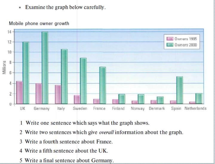
🧩 13. Practice Challenge

🔚 Conclusion
The Bar Graph Task is about comparison, grouping, and clarity — not numbers or decoration.
By mastering this simple 4-step structure and the vocabulary above, you’ll write fluent, accurate, and logically organized reports every time.
Remember the GoatGuru mantra:
“Write less, but write smart.”
With consistent practice, your next bar graph won’t be a challenge — it’ll be a Band 9 opportunity.
